A screenshot is not a photograph
Lossy image formats were tuned on photographs — soft gradients, noise, few perfectly straight lines. A screenshot is the opposite: large areas of exactly one color, and thin, high-contrast text strokes sitting on top of them. Compression settings that are invisible on a holiday photo are the reason your interface text comes out looking furry.
So instead of repeating the usual advice, we measured it on a real one: a 1440 × 900 capture of a product page, encoded to every format worth considering, then decoded and compared to the original pixel by pixel.
How we measured this
We classified every pixel in the source as either an edge — a steep local brightness change, which is what text strokes and UI borders are — or flat. Edges turned out to be just 4.3% of the image. Then for each format we computed the error separately on those two populations, so the numbers say where the damage actually goes rather than averaging it away.
Encoder: sharp with libvips 8.17, at the quality settings in the table. “Error” is the root-mean-square difference from the original on a 0–255 scale: 0 means identical pixels, higher is worse. This is one screenshot, not a benchmark — a denser or darker one will shift the numbers.
Where the damage lands
JPEG at quality 80 scores an overall error of 4.41, which sounds harmless. Split it and the picture changes: 2.20 on flat areas, 18.59 on text edges — more than eight times worse exactly where the reader is looking. Of every badly damaged pixel in that file, 68% sits on the 4.3% of the image that is text.
That is the whole problem in one sentence. Averages hide it, because most of a screenshot is empty. Your eyes do not average.
The formats, measured
Swipe the table to see more →
| Format | Size | vs PNG | Error on text edges | Reach for it when |
|---|---|---|---|---|
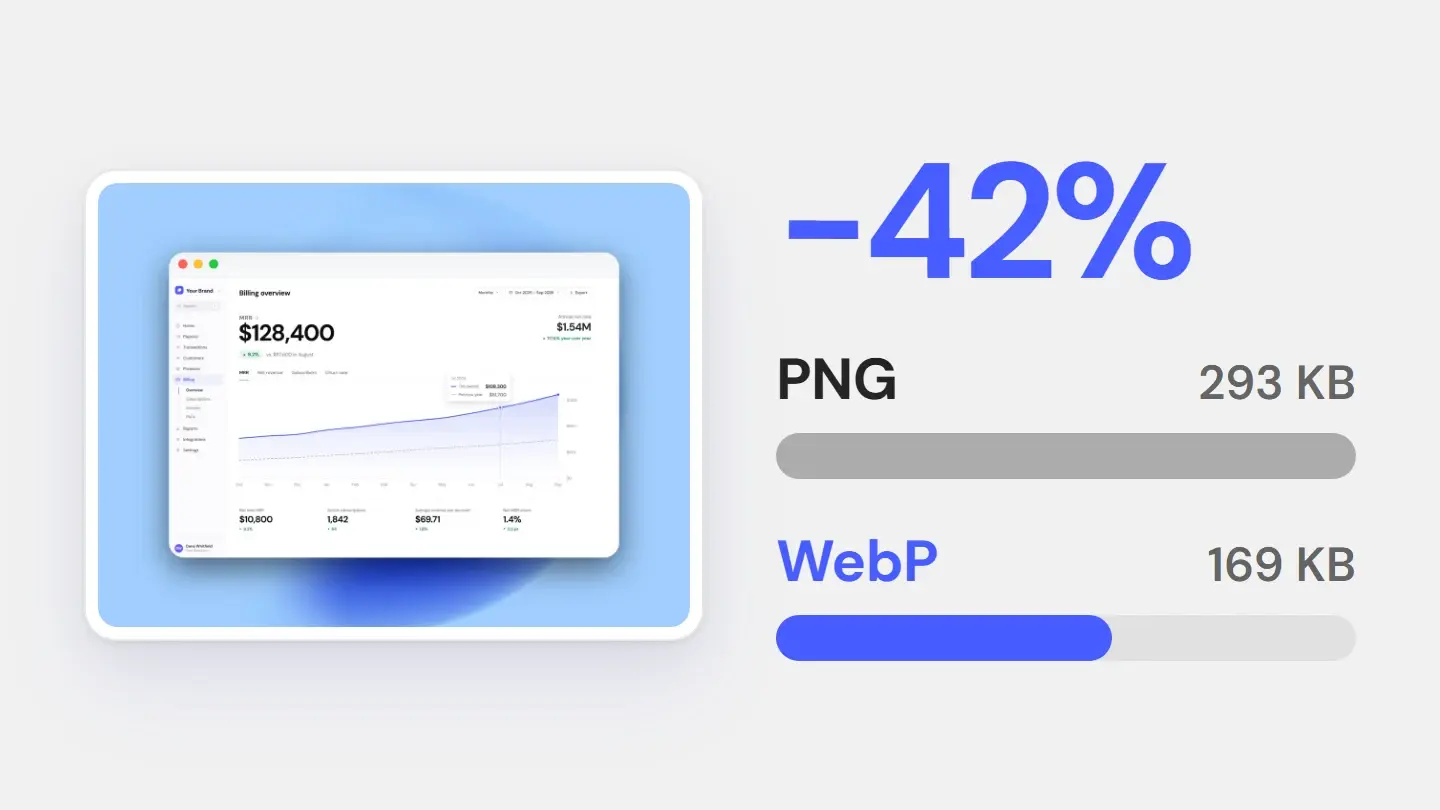
| PNG | 293 KB | 100% | 0.00 | The target only accepts PNG |
| WebP lossless | 169 KB | 58% | 0.00 | Default for screenshots on the web |
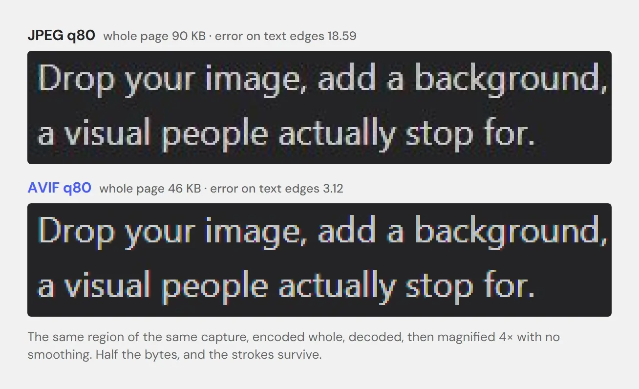
| AVIF q80 | 46 KB | 16% | 3.12 | Bytes matter and text must stay sharp |
| WebP q80 | 43 KB | 15% | 17.30 | Thumbnails, cards, previews |
| JPEG q90 | 122 KB | 42% | 17.13 | A file-size limit rules out PNG |
| JPEG q80 | 90 KB | 31% | 18.59 | Avoid for anything with small text |
Choosing one
Lossless: WebP before PNG
This is the finding worth changing your habits over. Lossless WebP produced a file 42% smaller than PNG with zero difference in pixels — not “visually identical”, literally identical, error 0.00 on edges and flat alike. 169 KB against 293 KB for the same pixels. If the place you upload to accepts WebP, PNG is simply the more expensive way to send the same image.
PNG keeps one real advantage: everything on earth opens it. App stores, ticketing systems, ancient CMSes, the colleague on a locked corporate laptop.
Lossy: AVIF before WebP
If you can afford to lose something and the destination accepts AVIF — usually your own site, rarely an upload form — lose it to AVIF. At quality 80 it came out at 46 KB — 16% of the PNG — with an error on text edges of 3.12. WebP at quality 80 lands at a comparable 43 KB but scores 17.30 on those same edges, and JPEG needs 122 KB at quality 90 to reach an equally mediocre 17.13. For text, AVIF is not a small improvement; it is a different category.
The cost is encoding time, and it is not subtle: in our run AVIF took around 320–410 ms per image against 17–21 ms for JPEG. Fine for an asset you export once. Worth thinking about if you are generating thousands on a server.
When JPEG is still the answer
When the destination accepts nothing newer. The App Store takes JPEG or PNG and rejects alpha channels; Google Play takes JPEG or 24-bit PNG, also without alpha; many email clients and internal tools are just as limited. Send PNG there. Use JPEG only when a file-size limit forces it, and then at quality 90: in our test it cost 32 KB more than quality 80 and improved text edges only slightly (17.13 against 18.59).
Export at 2x, always
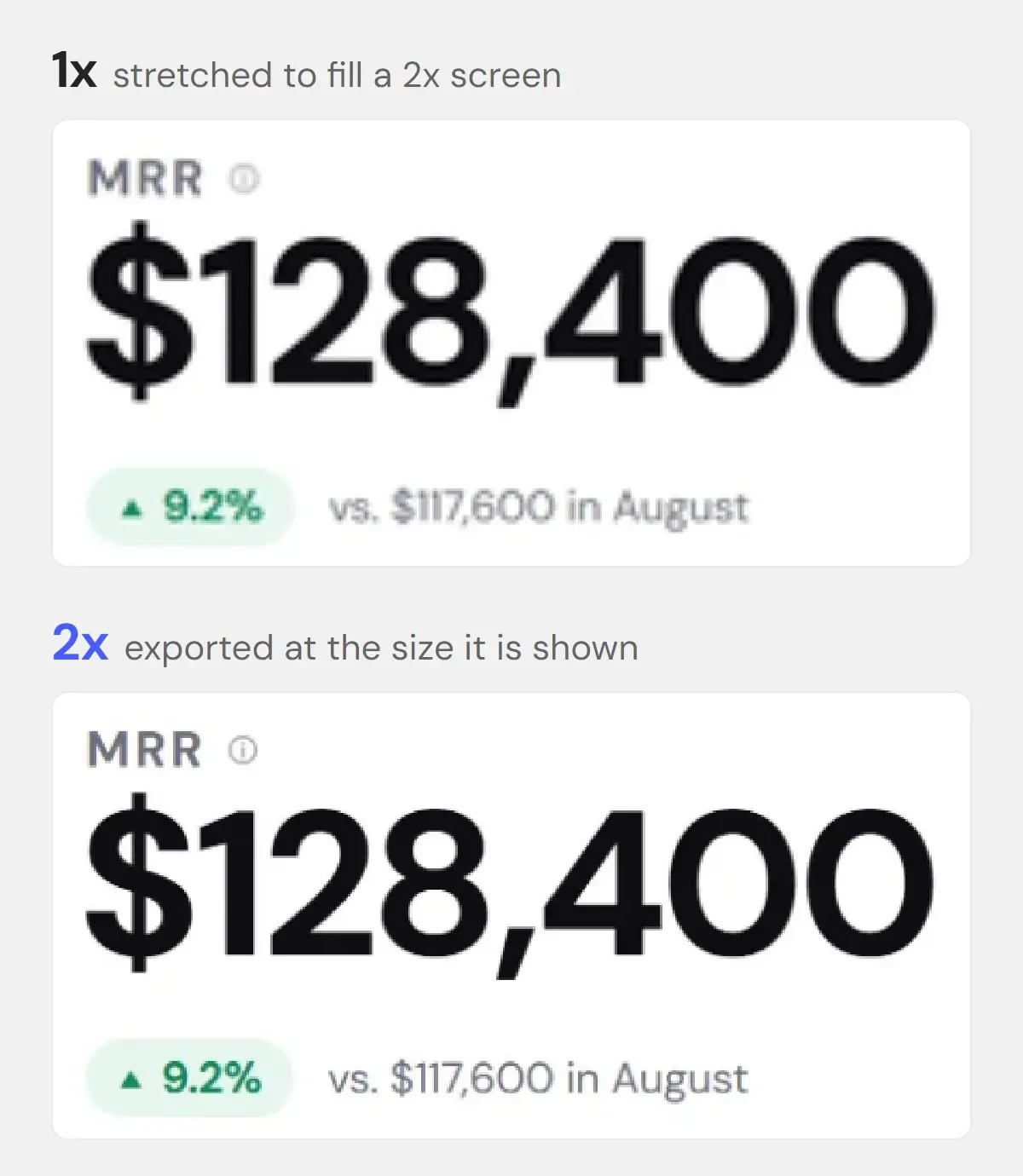
The most common way to ruin a screenshot has nothing to do with the format. It is exporting at 1x and letting a retina display stretch it back up.
We measured that too. Taking the 1x version of our screenshot and displaying it where the 2x version belongs produced an error of 53.99 on text edges — roughly three times worse than the sloppiest JPEG in the table. No format choice rescues that. It is the blur you have seen on a hundred landing pages and could not quite name.
The usual objection — that 2x costs four times the bytes — did not hold up. Doubling both dimensions cost 2.05×, not 4×, because the flat regions that dominate a screenshot compress almost for free. You are paying about double for something nobody has to squint at.
Format is the last decision, not the first. If the screenshot itself is cramped, flatly lit or fighting its background, no encoder will save it — that is a different problem, and we took it apart in why your screenshot looks cheap. Exporting at 2x is handled on the high-resolution export page.
Stop exporting screenshots that go soft
Style it once, then export at 2x as PNG, JPG or WebP — whichever the destination accepts.