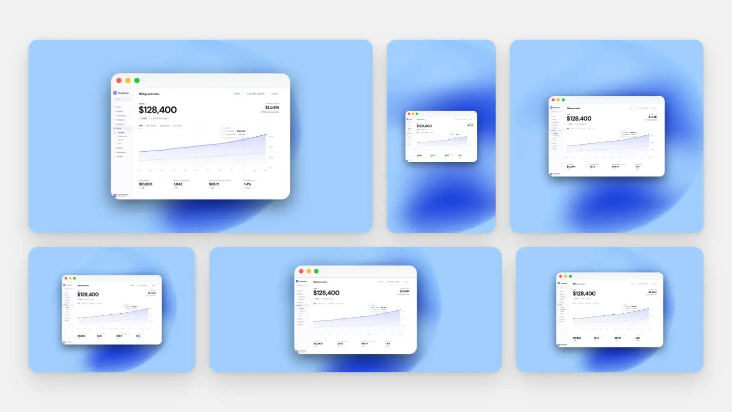
One capture, six crops
Shipping anything means the same screenshot has to appear in half a dozen places on the same day, each with a different shape and a different idea of what “too big” means. The usual approach is to capture six times, style six times, and end up with six slightly different-looking images of one feature.
The approach that holds up on launch day: capture once, at the largest size any destination needs, decide the style once, then crop and export per channel. Scaling down is free. Scaling up is not: a 1x file stretched into a 2x slot blurs text more than heavy JPEG compression does — we measured it in the format comparison. Start big.
The six destinations
Swipe the table to see more →
| Destination | Target | Rule or convention | The trap |
|---|---|---|---|
| Product Hunt gallery | 1270 × 760, under 3 MB | Rule | Needs 2+ images before the gallery is even viewable |
| Product Hunt thumbnail | 240 × 240, square | Rule | A wide screenshot squeezed into a square becomes unreadable |
| X post | Any ratio between 2:1 and 3:4 | Rule | Go outside that window and the feed crops your image |
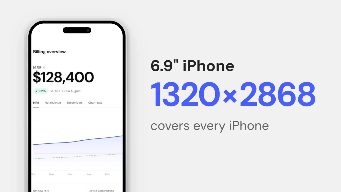
| App Store | 1320 × 2868 (6.9" portrait) | Rule | Alpha channels are rejected outright |
| Changelog / release notes | 2x the column width (~1600 px for an 800 px column) | Convention | Full-window shots make one changed button invisible |
| Documentation | Match the content column, exported at 2x | Convention | Goes stale silently after every UI change |
| ~1200 px wide for a 600 px body | Convention | Clients resize and often block images by default |
Platform rules vs house rules
That third column is doing more work than it looks. Four of these numbers come from the platform and will be enforced; three are conventions that no one will stop you from breaking. Guides routinely present both as though they were the same kind of fact, which is how you end up chasing a “required” email width that no email client has ever heard of.
The rules. Beyond the table: Product Hunt allows animated GIFs but plays them only on hover, and video must be a full YouTube URL. On X, a tall full-page screenshot is what the feed crops first — it loses its top and bottom. The other App Store sizes are in the store size guide.
The conventions. Changelogs, documentation and email have no published sizes, so the honest advice is a principle rather than a number: figure out the width your content column actually renders at, export at twice that, and never let the image be the thing that decides the layout. The ~600 px email body is a de-facto standard rather than a specification — it is what most templates assume. Export at 1200 px and set the image to display at 600 px wide in the email HTML: crisp on retina screens, no sideways scroll in older clients.
The order to work in
1. Capture at the ceiling. Whatever the largest destination needs, capture at least that. For a launch that includes an app store, that is the store asset; for a web product, a 2x capture of the widest layout you will show.
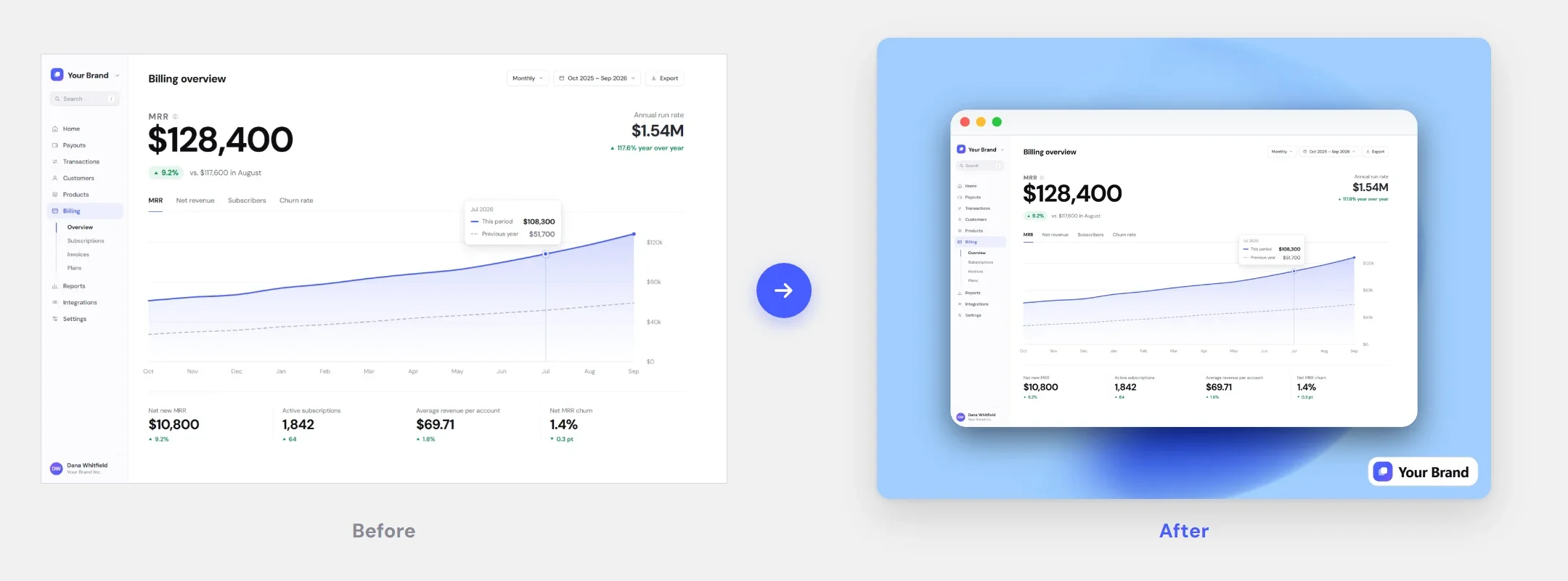
2. Decide the style once. Margin, background, shadow and radius are set once and saved, not re-judged for each channel — otherwise six versions come out six slightly different ways. The reasoning is in why your screenshot looks cheap.
3. Crop per destination, then apply the saved style. Square for the thumbnail, wide for the gallery, tall for the store. When text is at risk, crop tighter rather than scaling down.
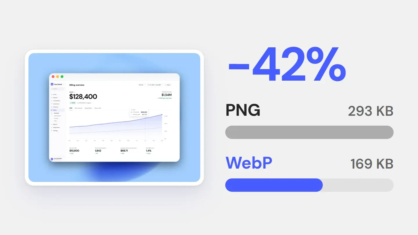
4. Pick the format at the end. Stores take PNG or JPEG with no alpha; the web takes WebP or AVIF at a fraction of the bytes. Decide it last.
Product Hunt figures are from its own launch preparation guide; the X aspect-ratio window is from X’s help documentation. Both checked in August 2026. Everything marked “convention” is exactly that — practice, not policy.
Style once, export for every channel
Save the look as a style, then export each version in the ratio it needs — PNG, JPG or WebP.