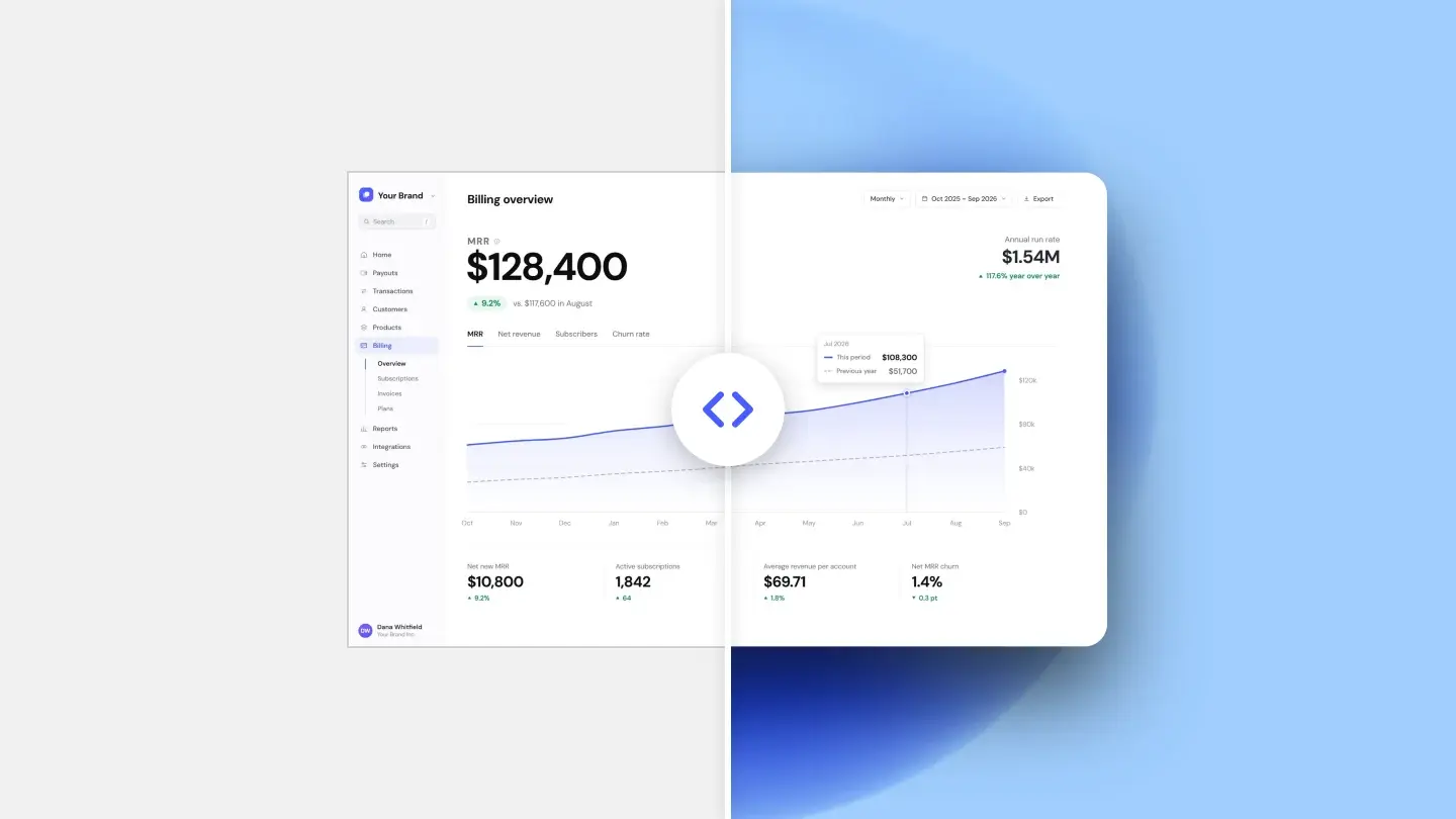
The raw capture is not a design
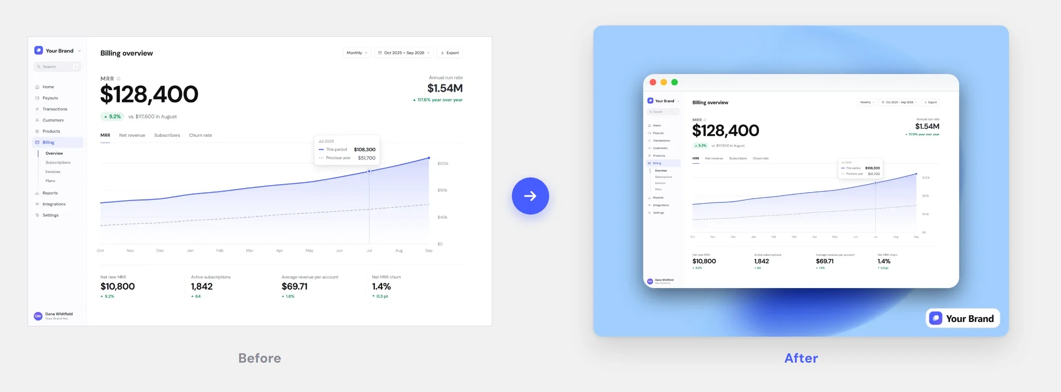
A screenshot straight out of the operating system is a piece of evidence. It is optimized for one job: proving what was on the screen. Nothing about it was decided by anyone — where it was cut, how much space is around it, what sits behind it. That is why it reads as unfinished the moment you put it next to real marketing material, even when the product in it looks good.
The gap between a raw capture and a screenshot that looks deliberate is not talent. It is five decisions, all of them small, all of them made the same way every time.
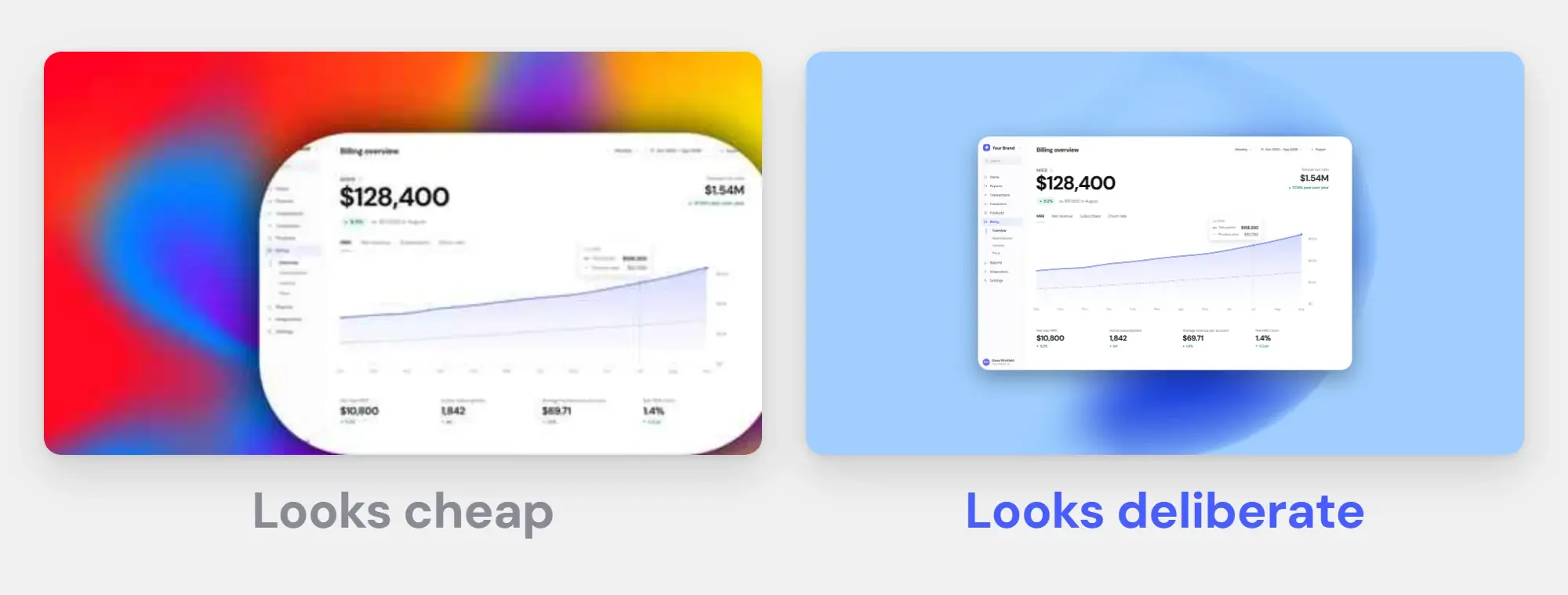
Five faults and their fixes
1. No breathing room: add a 5% margin
The single most common one. The interface runs straight into the edge of the image, so the eye reads the shot as clipped rather than framed — it looks like something went wrong during the capture, not like a choice.
The rule of thumb we use: give the shot a margin of about 5% of its shorter side, equal on all four sides. On a 1440 × 900 capture that is roughly 45 px. Less than about 3% and the framing stops registering; much more than 10% and the product becomes a stamp floating in a field.
2. A glow instead of a shadow: offset it down
Shadows are where good intentions go wrong. A uniform glow — the same blur on every side — is not a shadow at all. Nothing in the physical world is lit from every direction at once, so the result reads as a sticker with a halo.
A shadow that works has a direction. Offset it downward, keep the blur roughly two to three times the offset, and keep the opacity under about 15%. If you can point at the shadow and say where the light is coming from, it is doing its job. If it is visible before you look for it, it is too strong.
3. Corners at the wrong scale: match the real window
Rounded corners are a reference to something: a window, a phone, a card. When the radius does not match the thing being referenced, the image feels subtly off without the viewer knowing why. A macOS window rounded like a mobile app looks like neither.
There is a trap here that catches people who do everything else right: units. A retina capture has twice as many pixels across as what you saw on screen, so a 12 px radius on it looks like 6 px — half as round as the window it imitates. Judge the corners on the final image at its real display size, not by the number in the field.
4. A loud background: use one calm color
The background exists to separate the screenshot from the page around it. That is the entire brief. A busy multi-stop gradient, a photo, or a pattern with visible detail all do the opposite: they give the eye somewhere else to go, and the product you are advertising becomes the second thing anyone looks at.
Keep it calm — one color or a gentle gradient — and make it clearly lighter or darker than the main surface of your UI. A light app on a near-white background has no separation to offer; that is the case where the shadow ends up doing all the work and gets cranked up until it looks like a halo. Fix the background and the shadow problem usually solves itself.
5. Text too small to survive resizing: export at 2x, crop tighter
Your screenshot will not be displayed at the size you exported it. It will be resized by a store, a feed, or a gallery, and the fine print in your interface is what dies first.
Two different things kill small text. Upscaling: a 1x export shown on a 2x screen blurs text more than heavy JPEG compression does — we measured it in the format comparison — so export at 2x. Downscaling: a store or feed shrinks your image, and 2x does not help there, so crop tighter instead of shrinking the whole window. A readable detail beats an unreadable overview.
Swipe the table to see more →
| Fault | How you spot it | What fixes it |
|---|---|---|
| No breathing room | The UI touches the image border on at least one side | Margin of roughly 5% of the shorter side, equal on all four |
| Flat shadow | The same blur on every side, or no shadow at all | Offset down, blur 2–3× the offset, opacity under 15% |
| Wrong radius | Corners rounder than the window they imitate | Match the real chrome; judge it at display size |
| Loud background | Your eye lands on the background first | One calm field, clearly darker or lighter than the UI |
| Text too small | Labels turn to mush after the platform resizes it | Export at 2x; crop tighter instead of shrinking |
The fault that outweighs the other five
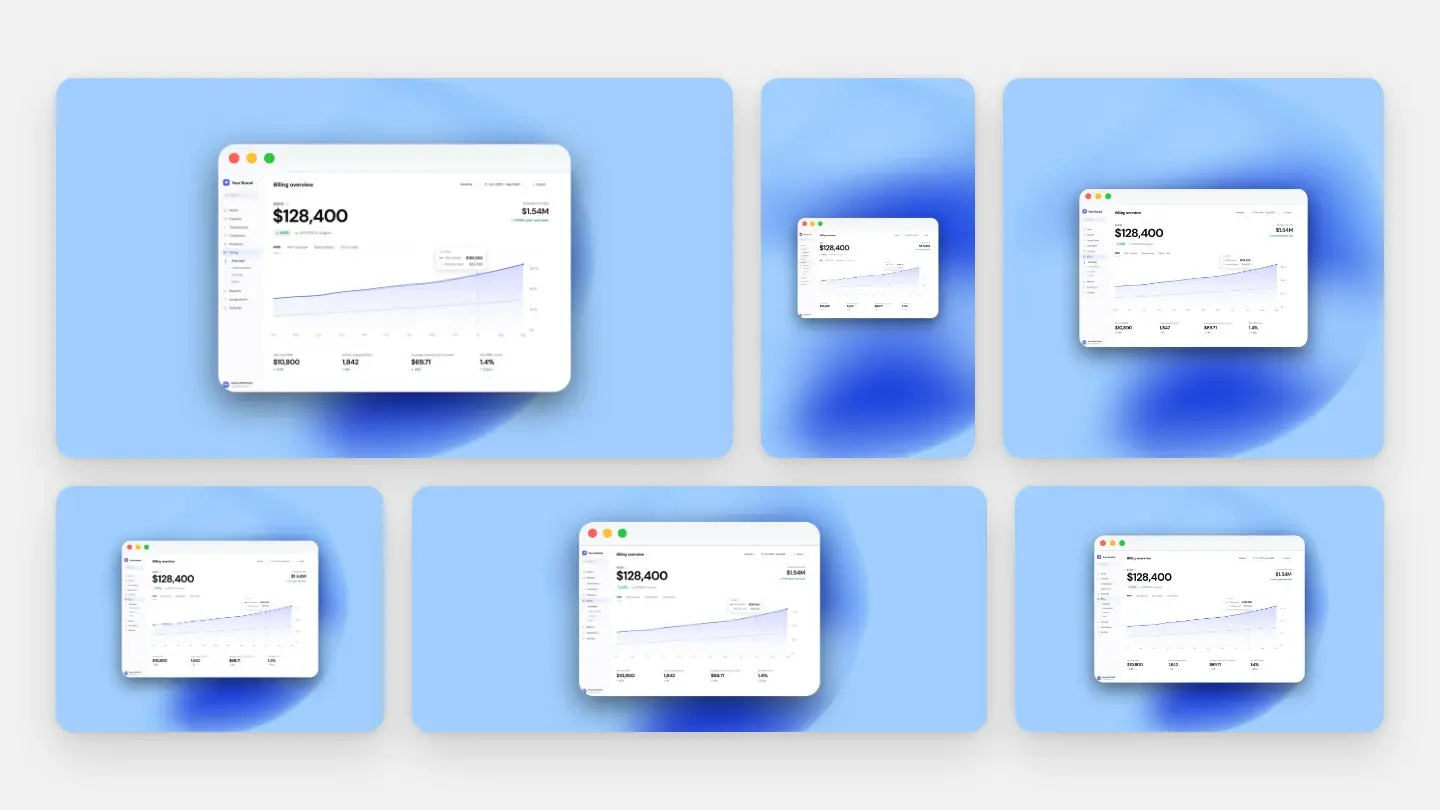
Everything above is about one image. The thing that actually makes a set of screenshots look professional is that they were all made the same way — same margin, same background, same radius, same shadow, same crop logic. A gallery of five individually decent screenshots with five slightly different backgrounds looks worse than five plainer ones that clearly belong together.
This is also the part that quietly breaks over time. You style three shots on Monday, ship a change on Thursday, redo one screen, and now that one has last week’s gradient at a slightly different angle. Nobody can name what is wrong, but the set stops looking deliberate.
Which is the real argument for saving a style instead of recreating it: it is faster, but more importantly it is the only way the tenth screenshot matches the first. When you have to reproduce a whole set across devices and locales, that stops being a nicety — we walked through that case in the App Store and Google Play size guide.
Make these decisions once
Save your background, shadow, rounding and frame as a style, and every screenshot after that matches.