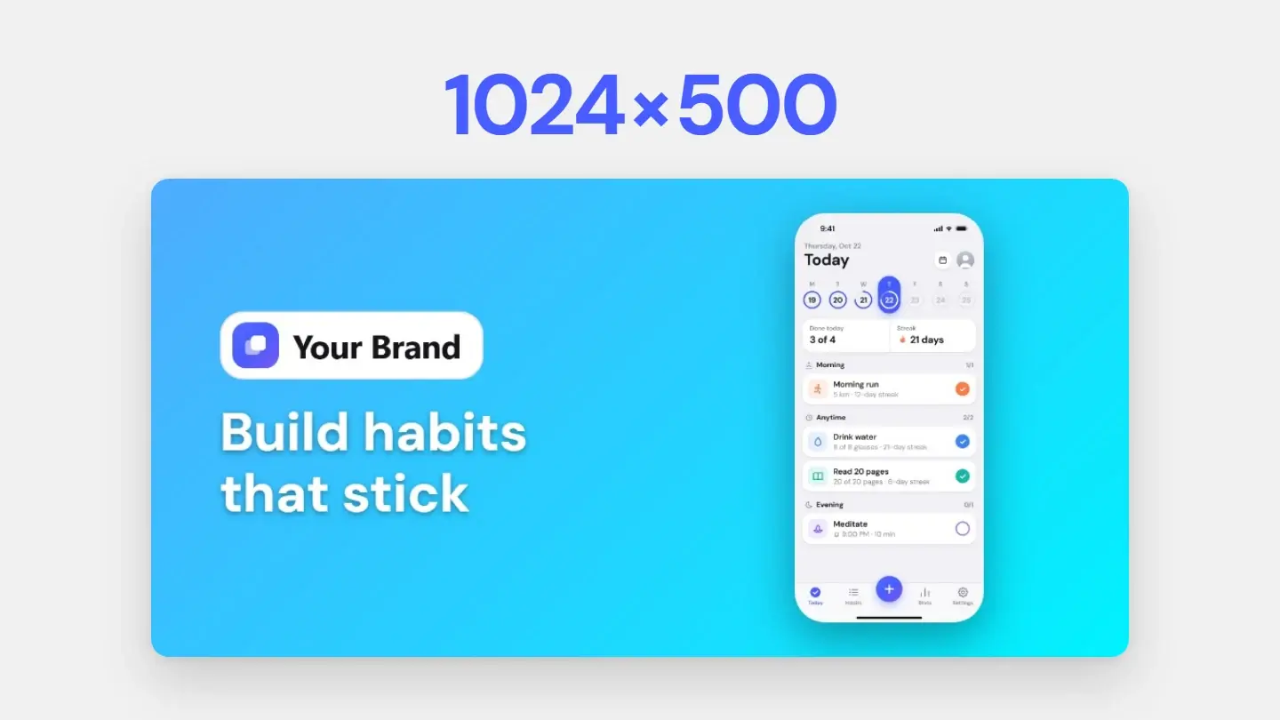
The short answer
The Google Play feature graphic is 1024 × 500 pixels, a JPEG or a 24-bit PNG with no alpha channel, and Google Play will not publish a store listing without one. It is the cover of your preview video and the banner of large-format collections, so keep the important part in the middle, use vibrant colours, and leave out devices, store badges and claims like “#1” or “Free”.
Where Google Play shows it
Not on every visit to your listing. Google Play uses the feature graphic in three places: as the cover of your preview video, with a play button over it whenever the video does not autoplay; in large-format app collections, which can include ads; and, for games, in large-format groups of recommended games. So it has to work as a banner and as a video cover at once — and anything near the edges may end up under a button or cropped away.
Google’s rules for the feature graphic
Google marks its feature graphic guidelines as highly recommended, and they are specific:
Swipe the table to see more →
| Guideline | Why it matters |
|---|---|
| Keep the logo, name, slogan and key UI near the centre | The edges can be cropped or covered by Google Play's interface, including the play button over a video |
| Use vibrant colours | Pure white, black and dark grey blend into Google Play's background |
| Leave out fine detail and small text | The graphic is often shown small on phone screens |
| Don't repeat your icon as prominent branding | The icon is already on the listing; extend the brand instead |
| No “Best”, “#1”, “Top”, “New”, “Free”, “Sale” or download counts | Performance, ranking, award and price claims are ruled out |
| No device imagery, store badges or third-party logos | Google asks for none of them, in the graphic or in screenshots |
| Localize it and avoid dated content | It is shown in every market and language you publish to |
When you upload it, add alt text of 140 characters or less that says what the graphic shows, without starting with “image of” or “photo of”.
What works on it
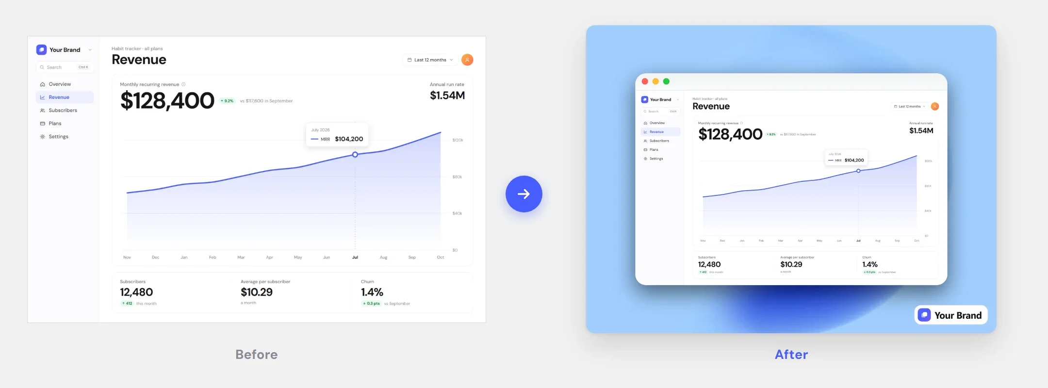
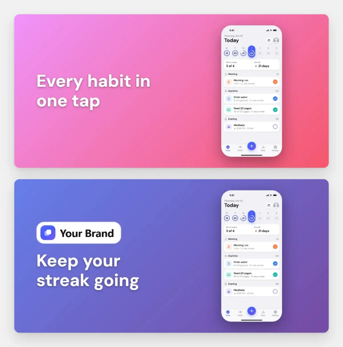
Within those rules, most good feature graphics use one of three layouts: a short headline beside the screen that matters most; one bold illustration of what the app does; or the interface itself, cropped to its key moment. Whichever you pick, test it at half size — if the headline is hard to read at 512 × 250, it will be hard to read on a phone. Both examples below were made from the same screenshot, in different colours:
Making one with your screenshot set
If you make your store screenshots in Screenshots.Guru, the feature graphic comes from the same style. In Store set, tick Google Play feature graphic, write a headline, and add your logo in the Brand Kit if you want it there. The graphic puts the headline and the logo on the left and your first screen on the right — without a device frame, as Google asks — on the set’s background, and the ZIP saves it as 00-play-feature-1024x500.jpg next to your screenshots.
Before you upload
- Exactly 1024 × 500 pixels, JPEG or 24-bit PNG, no transparency.
- Logo, name and headline well inside the edges.
- Readable at half size, with no small text.
- No device frames, store badges, rankings, prices or “Free”.
- A version for each language your listing is translated into.
- Alt text of 140 characters or less.
The rest of the listing — how many screenshots, at which sizes — is in the App Store and Google Play size guide.
Guidelines quoted from Google’s Play Console preview asset requirements, checked in October 2026.
Make it with your screenshots
Style the set once and download the screenshots and the feature graphic in one ZIP.